How to Calibrate an Online Ruler
Calibrate a browser screen ruler with a bank card or your display diagonal, verify the result, and learn what makes the calibration go stale
·
Why a screen ruler needs calibration
A web page cannot ask your monitor how large it is. The browser reports the screen in CSS pixels, and CSS defines one inch as exactly 96 CSS pixels. That convention has nothing to do with the glass in front of you. A 13.3-inch laptop panel with 2560 × 1600 device pixels has about 227 device pixels per inch; at a devicePixelRatio of 2 that is roughly 113.5 CSS pixels per inch, not 96.
On fine-pointer desktop screens this ruler starts at the 96 CSS-pixel reference. On touch screens it instead uses a device-based estimate. Neither can know the physical size of your display. For example, if the 13.3-inch laptop above drew 1 inch as 96 CSS pixels, it would be 96 / 113.5 ≈ 0.85 of a real inch. Calibration replaces that initial estimate with a value the screen ruler can check against a physical reference.
Method 1: bank-card reference
Use only a bank card that you know follows ISO/IEC 7810 ID-1: its long edge is 85.60 mm and its short edge is 53.98 mm. Cards from other standards may differ.
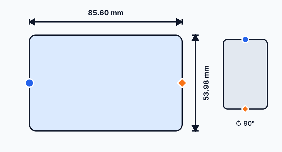
Choose a card placement and reference edge that fit the current viewport. The diagram explains the controls; it is not an actual-size reference.
- Reset browser zoom to 100 percent with Ctrl+0 (Windows or Linux) or Cmd+0 (macOS).
- Open calibration from any screen-ruler page.
- Choose horizontal or vertical card placement independently of the screen orientation, then choose the 85.60 mm long edge or 53.98 mm short edge.
- Align the selected edge with the fixed circle. Move only the diamond end with the slider, +/− buttons or direct drag; each fine step is 0.5 CSS px.
- If the full card does not fit, use the edge-only view, rotate the card or screen, choose the other edge, or use the screen-size method.
- Apply the calibration, then check the ruler with a physical reference. “Saved” means the browser stored the mapping; it is not a test result.
The calculation is
CSS PPI = reference CSS pixels × 25.4 / reference millimeters. The long
edge normally reduces relative alignment error, but the short edge is a valid
reference and can fit a narrow screen. If an 85.60 mm edge later reads 88 mm,
realign the card and recalibrate; narrowing the reference would move the PPI in
the wrong direction.
Method 2: the diagonal method
If you know your display's native resolution and its diagonal size, you can compute the density directly:
PPI (device px) = sqrt(width² + height²) / diagonal_in
PPI (CSS px)    = PPI (device px) / devicePixelRatio
For a 24-inch 1920 × 1080 monitor at a devicePixelRatio of 1: sqrt(1920² + 1080²) = sqrt(4,852,800) ≈ 2202.9 pixels along the diagonal, and 2202.9 / 24 ≈ 91.8 CSS pixels per inch.
Two cautions. First, marketed diagonals are rounded: a panel sold as 24 inches is often 23.8 inches, and that alone shifts the result by 0.8 percent. Second, the diagonal must be the visible panel, not the bezel. When the exact figure is uncertain, the card method is the safer choice because it measures the screen rather than trusting a specification sheet.
How to verify the result
After calibrating, hold the same card against the ruler. Its long edge should line up with 85.6 mm on the centimeter ruler, or with a hair under 3 3/8 in (3.375 in) on the inch ruler, since 3.370 in is 0.005 in short of that mark. If it does not, repeat the drag step; the most common cause is a card that was tilted or not pressed flat.
Other everyday checks: the short edge of the card is 53.98 mm, and the short edge of an A4 sheet is 210 mm if your screen is wide enough to show it. The accuracy page explains how the residual error of a calibration is estimated.
A calibration is a measurement of your screen, so it can be checked like any other measurement. If the card no longer reads 85.6 mm, recalibrate.
What invalidates a calibration
The saved record includes the CSS-pixels-per-inch mapping and detectable display metadata. Anything that changes the relationship between CSS pixels and physical pixels can make the mapping stale:
- Browser zoom. Ctrl/Cmd + and − scale devicePixelRatio with the zoom factor. A ruler calibrated at 100 percent is off by 10 percent at 110 percent zoom and by 25 percent at 125 percent. Press Ctrl/Cmd+0 before using the ruler.
- OS display scaling. Windows 125 percent or a different macOS Retina "scaled" option also changes devicePixelRatio. Unlike browser zoom, this is stable for a given setting, so a calibration made under it stays valid until you change the setting.
- A different monitor. An external display almost never has the same pixel density as a laptop panel. Recalibrate when you move the browser window to another screen.
- A different browser or profile. The value lives in that browser's storage, so each browser and each profile keeps its own calibration.
Changing the display resolution has the same effect as changing the monitor.
Where the calibration is stored
The browser saves a versioned record in localStorage for the site's origin.
It contains the mapping PPI (ppi), selected method (method), save time
(calibratedAt), and detectable display metadata (devicePixelRatio,
screenWidth, and screenHeight). This record stays in that browser; the app
does not upload it or link it to an account. Clearing site data removes it. If
storage is unavailable, the app says so and keeps the calibration only for the
current session. Without a valid saved record, the ruler uses its initial
estimate: the 96 CSS-pixel reference on fine-pointer desktops or a device-based
estimate on touch screens.
The methodology page describes exactly how the ruler turns that stored mapping into tick marks, and why the same calibration is shared by the centimeter, millimeter, and inch views.
Understand the status
Estimated means no saved reference has replaced the initial 96-CSS-px desktop reference or touch-device estimate. Saved means a browser mapping exists, not that physical accuracy has been proved. Review recommended appears when zoom or reported display characteristics changed; restore the intended mapping, recalibrate if needed, and verify with a physical reference. A different monitor can sometimes report the same values, so no browser-only check can certify a display change.
More guides
Why Browser Zoom Breaks an Actual-Size Ruler
See how page zoom and pinch zoom rescale CSS pixels, how to detect the change through devicePixelRatio, and a checklist to restore an actual-size ruler
Read guideHow to Calculate Screen PPI (Pixels Per Inch)
Learn the PPI formula, work through monitor, laptop, and phone examples, and see why a browser needs CSS pixels per inch rather than PPI alone
Read guideCSS Pixels vs Device Pixels vs Physical Size
Understand the three layers behind every on-screen measurement, why 96 CSS pixels per inch is only a convention, and how calibration closes the gap
Read guide